No Littering Video
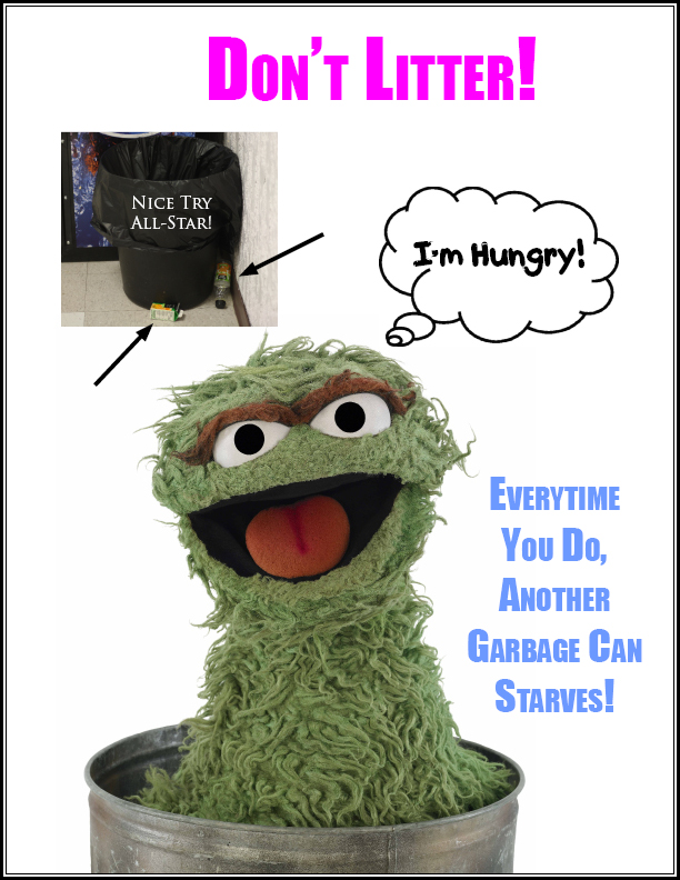
No Littering Poster
Comm Tech Commercial
Photographic Portfolio
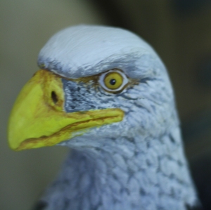
The theme I chose was anything that represented DHS. Whether it was an eagle, a picture of DHS, DHS’s logo or even the word itself.
Photo 1:

This is a photo of the DHS sign outside. I took a low angle shot of the sign because it was up high. Also, with me standing over to right of it it looked better than me just standing in front of it.
Photo 2:

This is a photo of the eagle soaring in Student Square. Again with me standing over to left of it it looked better than me just standing in front of it.
Photo 3:

This is a photo of the map of DHS. What better represents DHS than a map of it?
Photo 4:

This is a photo of a stained glass artwork in Student Square. I took this photo at a little bit of a low angle shot because it looked better than trying to get the photo straight on.
Photo 5:

This is a photo of the words DHS. I took this photo many times to try and get a clear, focused in one. I took this photo straight on because it would be easy for the camera to focus on.
Photo 6:

This is a photo of an eagle showing the past volley ball team. I wanted to make this another high angle shot but I wasn’t tall enough to look down on it.
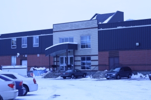
Photo 7:

This is a photo of DHS. I took many photos and this was the best one. I took a photo from the front, side and back view of the school, but this photo turned out the best.
Photo 8:

This is a photo of an eagle by the Phys. Ed office. Again, it was up high so I made it just a regular shot because it would be easy for the camera to focus on.
Photo 9:

This is a photo of the DHS logo. I would of liked to make this a high angle picture but, it was so far up on the wall that I couldn’t make it a high angle shot.
Photo 10:

This is a photo of the 2009 DHS graduates. There was no photo of the 2010 graduates so I went with the most recent. I took this photo straight on because the photo of the graduates was so large, also, it would be easy for the camera to focus on.
More Photography
Photo 1- A picture of a person inside:

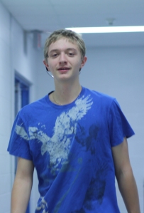
I took this photo because Josh was every where I was, I was in student square, so was he. I went down to the cafe., and he was there.
Photo 2- A picture of a person outside:

I took this photo because it was a cold day and Brock was there with me.
Photo 3- A ‘natural’ portrait:

I took this photo because I didn’t feel like taking a “creeper” shot of anyone I didn’t know.
Photo 4- A close up of an object:
I took this photo because there was glass in front of it and this is the only angle where I could take the photo without getting the glare from the glass.
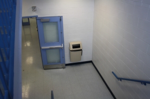
Photo 5- A picture of a building:
I took this photo because it was a cold day and I didn’t have to walk very far.
Photo 6- A picture of a lot of something:

I took this photo because I saw these cars after I took photo 6.
Photo 7- A picture of a colour:

I took this photo because I was comming up from the cafe. after taking photo 1 and I saw the gym door.
Photo 8- A picture of a texture:

I took this photo because it was the first texture I saw.
Photo 9- A picture of a hand or hands:

I took this photo because I didn’t feel like asking somone I didn’t know, “Can I take a picture of your hands?”
Photo 10- A picture that shows repetition:

I took this photo because on the website this was an example of repetition.
Photo 11- A low angle picture:

I took this photo because the eagle is up high and it would be a perfect shot for a low angle picture.
Photo 12- A high angle picture:
I took this photo because I could stand on the stairs and take a picture looking down at it.
Photo 13- A picture of someone moving:
I took this photo because I saw Eagon taking a drink and then I asked him if he would walk so I could take a photo.
Photo 14- Bonus 1:

I took this photo because it looks cool. This is me looking up at a light near the phys. ed office.
Photo 15- Bonus 2:

I took this photo because I needed another bonus photo, so I asked someone if they would press the button to make water come out.
ABC Photography

Random Logo
Corporate Logo

Combination Logos


The best Combination logo is the CLF logo because it can be printed anywhere, anysize and you would know what its about. It is distinctive because because you have to know its about football because of the football in the logo. Also it is appropriate because there is a Canadain Maple Leaf on there and and football; so the CFL must mean Candain Football League. It is simple enough that you could pick it out of a crowd of other logos. Lastly, it is trendy because as long as I’ve know the CFL it has been their logo.


![]()
![]()
The best figurative logo is the iTunes logo because it can be any size and it would be still reconizable, also it is distinctive because you know the program is about music/videos because of the music note and the CD. It is apporopite because Apple products you can listen to music or watch videos. It is simple and easy to recognize. It is trendy because this has been the iTunes logo for a while now.

Recent Comments